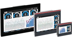
"An effective HMI gives the operator better situational awareness. Your plant is successful only if your operators are successful. [An effective HMI] helps operators deal more effectively with abnormal situations. It helps them do proper operating techniques. Poor HMIs impede that." So says Bill Hollifield, principal alarm management and HMI consultant at PAS and co-author of The High Performance HMI Handbook.
So how do your control-room HMIs measure up? Do they provide that essential situational awareness and operator support? What follows are some basic rules for designing a good, modern HMI.
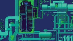
Figure 1. A tricked-out PID drawing with flashy designs, animation, shadows, bright colors, 3D renderings and inconsistent color coding are confusing and doesn't tell your operators what they need to know.
Getting Trendy
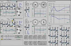
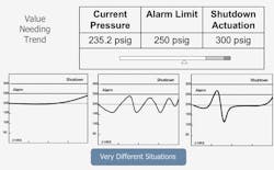
According to Hollifield, one of the most glaring deficiencies in HMI design is the lack of trending information. He says that almost every graphic has one or two values on it that would be much easier to understand if they were presented as trends. He adds that ideally, trends should be embedded in the graphics, and appear whenever the graphic is called up.
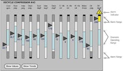
Figure 3. Analog depictions are very powerful because humans are hard-wired to understand pattern recognition.
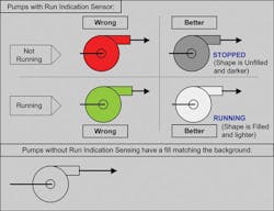
Figure 4. Relative brightness plus a WORD is the best presentation. Things brighter than the background are on; things darker than the background are off.
Alarming Situations
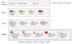
Figure 5. Alarms should be depicted redundantly based on priority.
They should be consistently coded by color, shape and text.
Alarm colors should never be used for anything else in the HMI.
The Importance of Trends
Figure 6. Trends should show both normal and abnormal ranges
and answer the question: "Where am I as compared with
where I should be?"
[Editor's note: This article depends heavily on material found in presentations by Bill Hollifield and Paul Gruhn. Thanks to both of them for their help in its preparation.]
Extra-Credit Reading
We've only scratched the surface here. More much more detailed information on high-performance HMI is avaialble. Check the following:

Leaders relevant to this article:
